Simple Calendar for Non-Technical Users
This project is a straightforward calendar website designed for easy management by non-technical individuals. It can be shared with others, making it ideal for scenarios like managing bookings for a single tennis court. The primary user, in this case my mother, is not tech-savvy, which influenced the design choices.
Requirements
Before development, I carefully considered all potential features and use cases. As the end-user was non-technical, I had to anticipate their needs rather than rely on direct input. This approach is often necessary in various development scenarios where customers may not fully know their requirements.
Key requirements included:
- Simplicity: Prioritize ease of use with minimal clicks and data entry.
- Mobile Responsiveness: Ensure functionality on mobile devices, specifically an iPhone 6.
- Shareable: Allow users to share the calendar, displaying court availability.
- Role-Based Access: Restrict booking management to admin accounts, while others can view only.
- Historical Data: Provide full booking history access to admins, with limited view for others.
- Privacy: The main audience consists of a subset of people playing in a tennis league. The calendar should not display the names of other players, and the website should not be indexed by search engines.
Tech Stack
To maintain simplicity and leverage existing expertise, the following technologies were chosen:
- Next.js for frontend development
- Supabase for data storage and authentication
- Tailwind CSS for styling
- shadcn/ui components for UI elements
Implementation
Pages
The website consists of four main pages:
- Home: Displays the primary calendar view.
- Login: Handles admin authentication with automatic redirection and cookie-based session management.
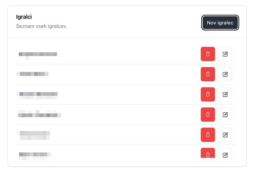
- Players: Allows admins to manage player information, simplifying the booking process.
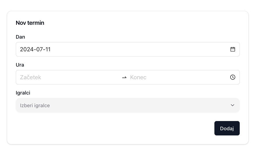
- Bookings: Provides admin access to booking management.
Preview
Calendar
Let's examine the primary calendar interface:
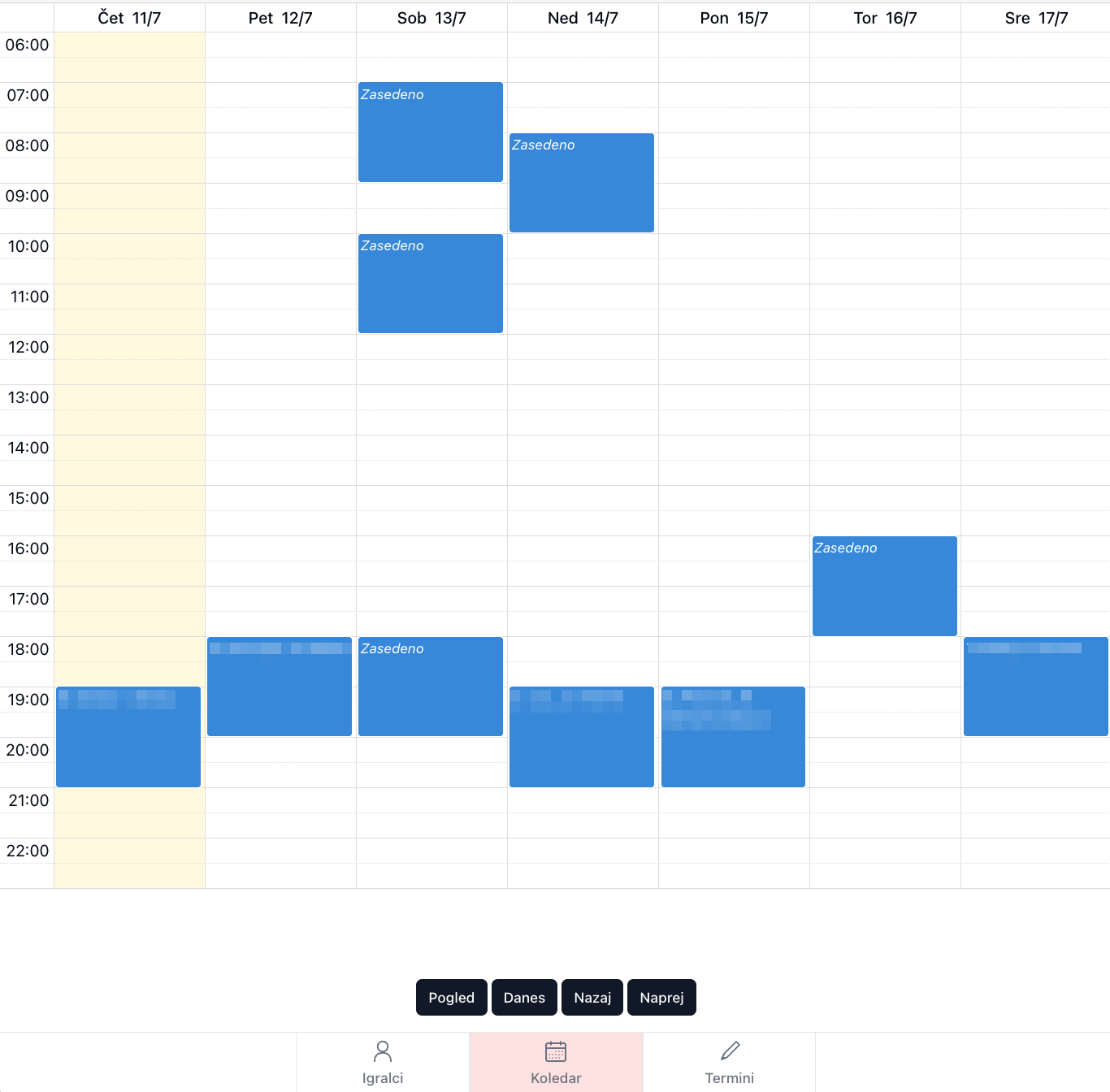
Note: Player names have been blurred to protect privacy.
Key features:
- The term "zasedeno" (Slovenian for "booked") appears when player names are hidden.
- This label maintains user privacy while indicating court availability.
- Logged-in users see a bottom navigation bar for quick page switching, while regular visitors only view the calendar
The calendar offers multiple viewing options to enhance usability across devices. A 3 day view optimized for mobile and a monlthy list view, ideal for longer-term planning:
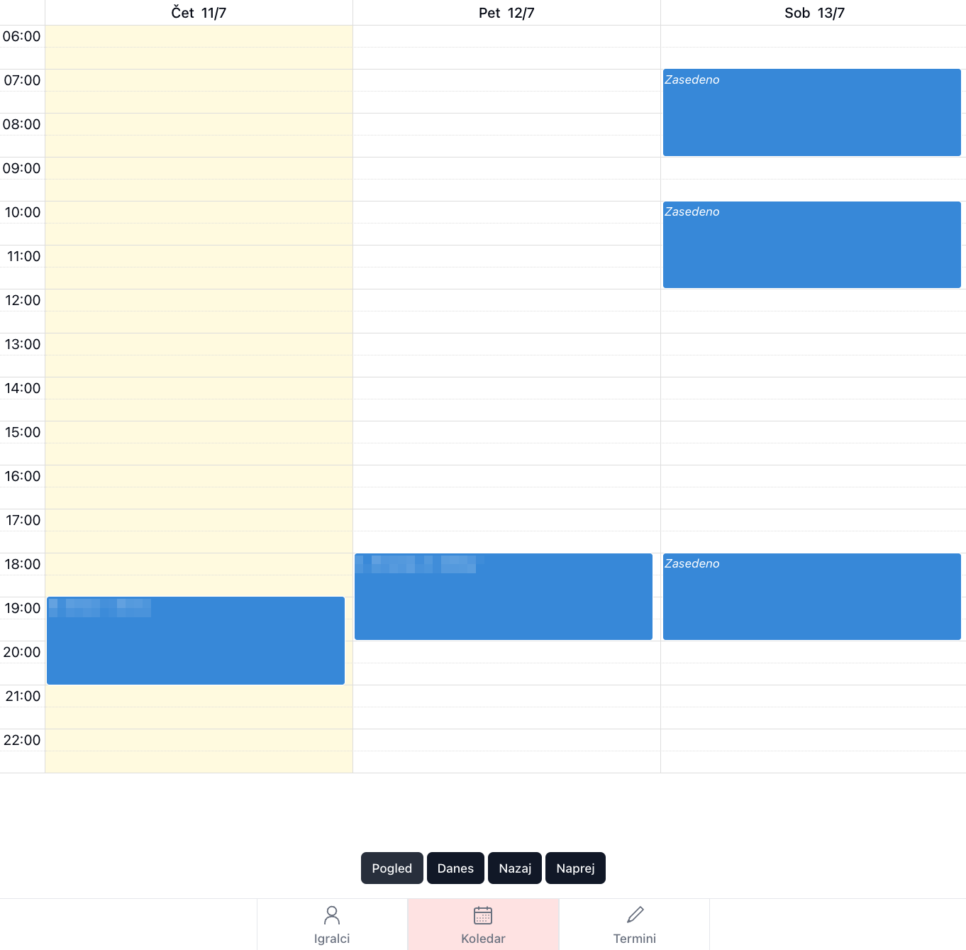
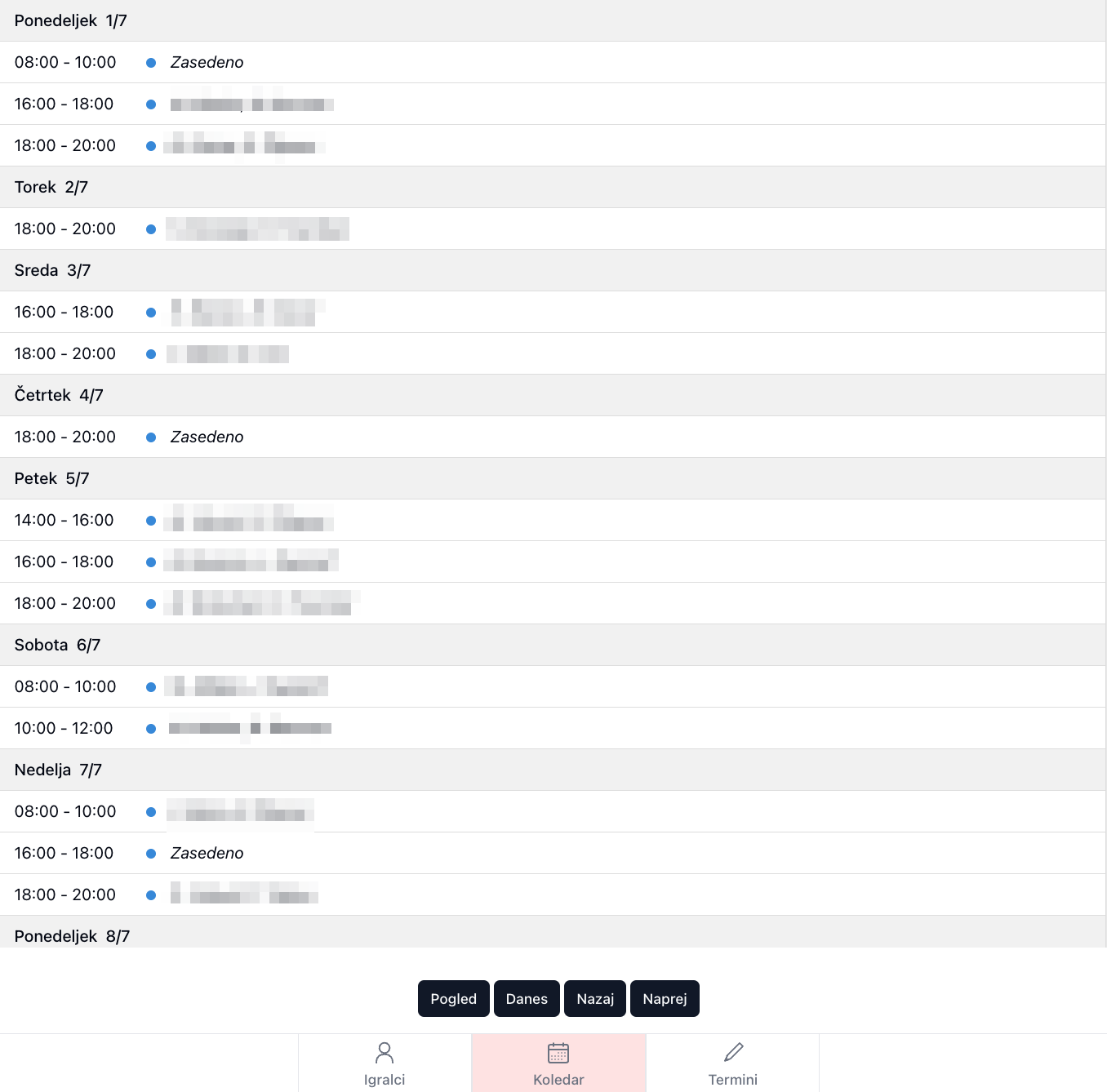
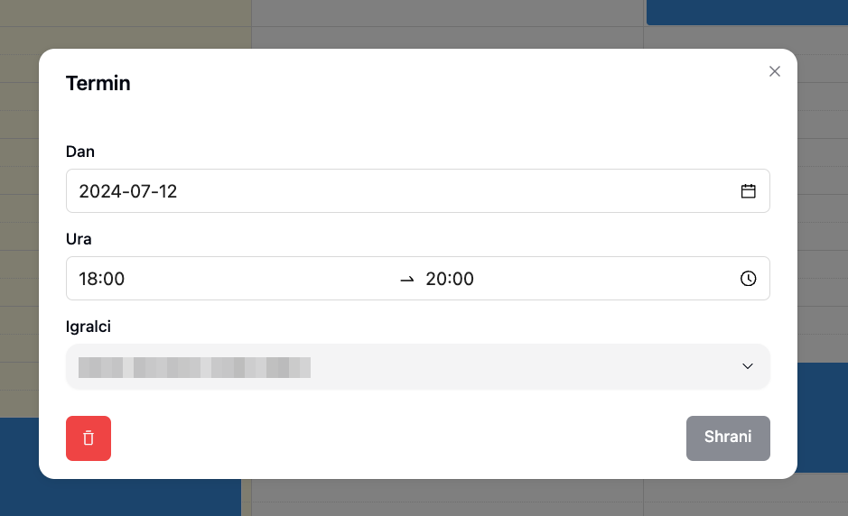
Users can view booking details by selecting specific slots, while admins have the additional ability to update these bookings:
Player Management
Simple overview of all players, with the ability to add, edit, or delete players:
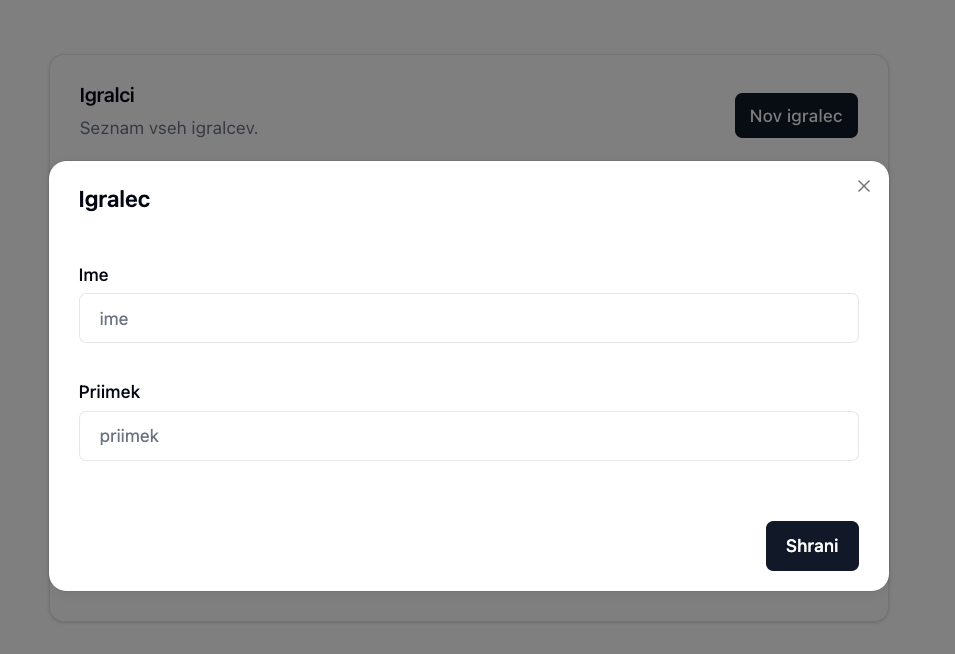
Players are added inside a modal. The modal doesn't dissmis when clicked outside, to prevent user errors:
Booking Management
Main booking page:
Time-picker for scheduling:
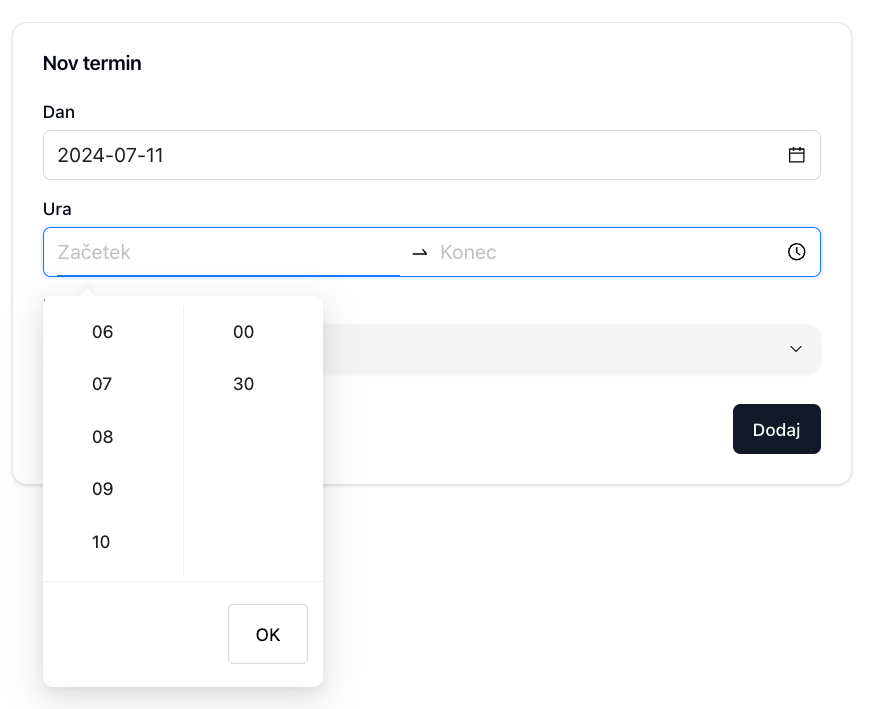
Future enhancement: Replace time-picker with a mobile-optimized version.
Conclusion
This project highlighted the importance of thorough requirement analysis before development, especially when creating solutions for non-technical users. It demonstrated that designing for simplicity and usability is often more challenging than building complex systems.
The website has been successfully implemented and is used daily without reported issues. Its effectiveness led to the creation of a simplified fork, which replaced the player management feature with a general textarea for broader applications.
Key takeaways:
- Prioritize user needs and simplicity in design.
- Consider all potential use cases and edge scenarios.
- Regularly reassess and refine features based on user feedback and usage patterns.
The success of this project underscores the value of user-centric design in creating practical, efficient solutions for everyday problems.